


ABOUT THE MAKERS
Although a fairly recent brand (established in 2009), Kleid has already left its mark on the established Japanese (and worldwide) stationery scene. The name might mean “dress” in German, but it’s not as simple as that. Here’s what the founder has to say about that:
“Originally, the word “kleid” is spelled as “kleit” in German. In the sense of clothes and dresses, this embodies the concept of “fusion of fashion and stationery”. The actual spelling of the brand name, however, is not “kleit” but a coined word, “kleid“. It’s the sound of the words when printed with a typewriter. In addition, the distinctive mark of the brand, which looks like a pen tip slightly protruding from a square piece of paper, has the meaning of “exceeding the existing frame” and is likened to the shape of the letter “k” in kleid. I wanted the name to have a memorable sound.”
One of the major features of kleid notebooks is the paper called “OK Fools Paper”. The roots of this “fools paper” are very old; it is a paper that often appears in the masterpiece “Sherlock Holmes” published in the 19th century by British writer Conan Doyle. It is said that the paper was originally watermarked with the words “Fool’s Hat” hence the name. The first time this paper was imported from England to Japan was in the Meiji era, and the “fools paper” made in Japan thereafter became known as “OK Fools Paper”.
The most attractive point of this paper is its writing feel. It is not slippery or rough and is smooth enough to absorb ink. In addition, there is a watermark on each page, giving you a sense of the unique quality of high-quality paper.
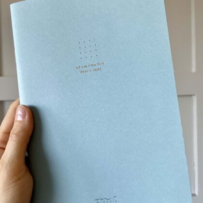
All kleid products have a square gold-lettered tag embossed in the lower corner of the cover. The design borrows from an American military standard. Overall, kleid’s stationery has been “deeply inspired” by the military, according to the company owner. The tags use German industrial font that is “inorganic but beautiful”, and the company is particular about changing the notation of each product name and product color.
On the cover of the 2mm grid notebooks, the tag is designed to align perfectly with the grid. It’s just one of the details the company has obsessed over getting just right. To match the positions of the tag with the grid has been a mammoth task in itself, but so is the grid print as the line color is either showing too dark or too light.
The reason behind the 2mm grid over the 5mm grid is quite specific – the company owner believes that the 5mm grids “box in” the writer, who feels like their letters have to fit inside the 5mm squares. With 2mm squares, the task becomes quite impossible, which means the writer naturally throws off these shackles and writes with letters of any size comfortable to them. And, of course, shapes and illustrations can be drawn more precisely than 5mm.
Reviews
There are no reviews yet.